
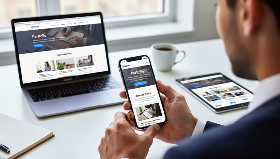
Stop sending PDF portfolios to potential clients unless you’ve optimized them for user experience—or better yet, consider whether a PDF is holding your freelance writing career back. Upload your portfolio to a dedicated website platform with responsive design that works seamlessly across mobile devices, tablets, and desktops, ensuring clients can view your work anytime, anywhere without downloading files. Convert lengthy PDF documents into scannable web pages with clear navigation, prominent contact information above the fold, and quick-loading samples that showcase your best work in under three seconds. Track which pieces clients actually read by using analytics tools available through portfolio websites, something impossible with static PDFs that disappear into email inboxes.
The uncomfortable truth is that many talented writers struggle to land clients not because their writing lacks quality, but because their portfolio delivery method creates friction in the hiring process. PDFs require downloads, often won’t open properly on mobile devices, and make it difficult for busy clients to quickly assess your skills. These portfolio conversion issues cost you opportunities every day. If you’re committed to using a PDF format, you’ll need to understand exactly what makes them problematic and how to optimize them strategically. More importantly, you’ll discover when alternative formats serve your career better, helping you convert more prospects into paying clients who value your expertise.

The Problem with Traditional PDF Writing Portfolios
Why Clients Abandon PDF Portfolios Within Seconds
Picture this: A potential client opens your email, spots your portfolio attachment, and immediately feels a wave of hesitation. That 15MB PDF you carefully crafted? It’s taking forever to download on their phone during their morning commute. By the time it loads, they’ve moved on to the next candidate.
This scenario plays out countless times daily, and it’s not because clients don’t value your work. The friction happens before they even see your writing samples.
File size creates the first barrier. Large PDFs eat up bandwidth and storage space, especially problematic when clients review portfolios on mobile devices. Many simply won’t wait for a hefty file to download, particularly when they’re screening dozens of applicants.
Then there’s the download barrier itself. Clicking a link that forces a download triggers security concerns for many users. They’re thinking: Is this file safe? Do I really want another document cluttering my downloads folder? These split-second doubts often lead to abandoned reviews.
Even when clients do open your PDF, they face cognitive load. Opening a document requires switching contexts, waiting for their PDF reader to launch, and navigating an unfamiliar layout. Compare that to clicking a link that opens instantly in their browser, where they can scroll naturally and click between pages effortlessly.
The reality is that PDFs ask clients to work harder to evaluate you. When they’re comparing multiple writers, the path of least resistance usually wins. Your stellar writing samples deserve better than to be trapped behind these unnecessary obstacles.
The Mobile Experience Gap
Here’s something many writers discover the hard way: a potential client gets excited about your work, opens your PDF portfolio on their phone during their commute, and immediately gives up in frustration. The reality is that more than half of your portfolio viewers are now accessing your work on mobile devices, and PDFs simply weren’t designed for small screens.
Think about your own experience trying to pinch, zoom, and scroll through a PDF on your phone. It’s clunky at best. Text becomes unreadable, images don’t scale properly, and navigation feels like solving a puzzle. Your beautifully designed PDF that looks stunning on a desktop computer transforms into an accessibility nightmare on a tablet or smartphone.
This mobile experience gap can cost you opportunities. When a busy editor reviews submissions during their lunch break or a marketing manager checks portfolios while traveling, they’re making quick decisions. If your portfolio creates friction, they’ll simply move on to the next candidate whose work is easier to view. The good news? Understanding this challenge puts you ahead of writers who haven’t considered how their portfolios perform across different devices, and there are practical solutions that can help you meet clients wherever they are.
What Brand-Aligned Conversion UX Actually Means for Writers
Your Portfolio as a Conversion Tool, Not Just a Showcase
Here’s the reality many freelance writers miss: your portfolio isn’t a museum display. It’s a sales page. Every element should guide potential clients toward one clear action—hiring you.
Think about the last time you made a purchase online. You didn’t just look at product photos and wander off, right? You followed a path: you saw the benefits, understood how it solved your problem, reviewed social proof, and found a clear way to buy. Your portfolio needs to create this same journey.
Start by identifying what decision your ideal client needs to make. Are they comparing you against other writers? Trying to justify your rates to their boss? Wondering if you understand their industry? Your portfolio should answer these specific questions in a logical sequence.
Place your strongest, most relevant samples first—not your personal favorites. Within seconds, clients should see work that mirrors their needs. Follow this with brief context about each project: the challenge you solved, your approach, and measurable results when possible. This transforms clips from passive examples into compelling case studies.
Include clear next steps throughout. After showcasing your expertise, make it effortless for clients to contact you. Add your email, booking link, or contact form in multiple places—at the beginning, middle, and end.
Remember, every writer has samples. But writers who understand the client’s decision-making process and design their portfolio accordingly? They’re the ones who consistently land better projects at better rates.
Essential UX Elements Every Writing Portfolio Needs
Clear Navigation and Scannable Structure
Busy clients often spend less than two minutes reviewing your portfolio, so making information easy to find is crucial. Think of your PDF portfolio like a well-organized bookshelf—everything should have its logical place.
Start by grouping your writing samples into clear categories that match how clients think. Instead of organizing chronologically, try grouping by industry (healthcare, technology, finance) or content type (blog posts, white papers, case studies). This lets potential clients jump straight to what matters most to them.
Create a clickable table of contents at the beginning of your PDF. Most modern PDF creators let you add internal bookmarks and hyperlinks, transforming your document from a static file into a navigable experience. Each category should be clearly labeled and easy to access.
Use visual hierarchy to guide the eye. Larger headings, consistent spacing, and strategic use of white space help readers process information without feeling overwhelmed. Remember, cognitive load is your enemy—the easier you make it for clients to understand your work, the more likely they’ll remember you.
Consider adding a one-page “quick reference” sheet near the front that highlights your specialties and best samples. This cheat sheet gives time-pressed clients an instant overview, with page numbers directing them to full examples. One freelance writer reported landing three new clients after adding this simple navigation tool to her portfolio.
Strategic Calls-to-Action That Feel Natural
Your portfolio should make it incredibly easy for potential clients to take the next step. Include your contact information prominently on the first page and again at the end. Think of it as removing barriers between you and your next opportunity.
Create a simple closing statement that invites connection without sounding desperate. Something like “I’d love to discuss how my writing can support your next project” feels professional and welcoming. Include your email address, LinkedIn profile link, and website if you have one.
Consider adding a brief statement about your availability and preferred project types. This helps clients self-qualify and saves everyone time. For example, “Currently accepting new clients for long-form content projects starting in March.”
Position yourself as the solution to their needs rather than someone who needs work. Frame your call-to-action around the value you bring: “Ready to elevate your brand’s content?” creates more interest than “Please hire me.”
Remember, confident writers who make reaching out effortless tend to get more responses. Your contact section should feel like an open door, not a formal application process. Keep it friendly, clear, and action-oriented.
Fast Loading and Accessibility
Making your PDF portfolio accessible to everyone isn’t just good practice—it’s essential for reaching more potential clients. Start with optimized images that look sharp without creating massive file sizes. Large files frustrate clients with slower internet connections and may not even open on some devices.
Choose clean, readable fonts like Arial, Calibri, or Georgia at 11-12 point size minimum. Script fonts might look creative, but they’re difficult to read on screens and nearly impossible for people with visual impairments. Keep your file size under 5MB by compressing images and avoiding unnecessary graphics.
Remember that accessibility features help everyone. Add alternative text descriptions to images, use proper heading structures, and ensure sufficient contrast between text and backgrounds. These simple adjustments mean clients using screen readers or assistive technology can navigate your work just as easily as anyone else.
Test your PDF on different devices before sending it out. What looks perfect on your laptop might display differently on tablets or phones. A portfolio that loads quickly and works for everyone shows you understand user experience—a valuable skill that reflects well on your professionalism.
Better Alternatives to Static PDF Portfolios
Simple Portfolio Websites (No Tech Skills Required)
You don’t need to be a web developer to create a stunning online portfolio. Several user-friendly platforms let you showcase your writing samples beautifully without touching a single line of code. Think of these simple portfolio websites as your professional home on the internet, where potential clients can easily browse your work.
Contently offers a clean, writer-focused platform that’s specifically designed for content creators. You simply upload your published articles, and the platform organizes them into an attractive, searchable portfolio. Clippings.me takes things even further by automatically importing your bylines from major publications, saving you hours of manual work.
For those wanting more customization, WordPress.com’s free plan includes beginner-friendly templates that require zero technical knowledge. You can drag and drop elements, add your bio, and upload samples in minutes.
Toronto-based writer Sarah Chen landed her first $5,000 contract after switching from a PDF portfolio to a Contently profile. “Editors told me they loved being able to browse my clips on their phones during their commute,” she shared. “With my old PDF, they’d wait until they were at their desk, and by then, they’d moved on to other candidates.”
The key advantage? These platforms are mobile-responsive, searchable, and always accessible. No more worrying about file size limits or compatibility issues. Your portfolio works everywhere, instantly.
Interactive Online Portfolios
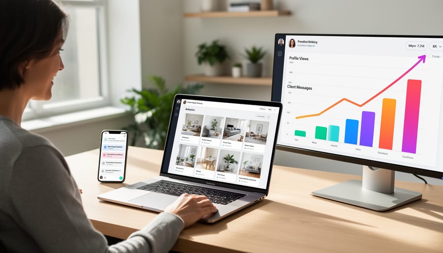
Interactive online portfolios represent the gold standard for showcasing your work dynamically. These platforms allow potential clients to filter projects by category, search for specific topics, and experience your work in ways that static PDFs simply can’t match. Popular options include custom WordPress sites, Contently profiles, and specialized platforms like Clippings.me.
The beauty of interactive portfolios lies in their flexibility. Clients can quickly find relevant samples without scrolling through dozens of pages. You can update content instantly, track which pieces generate the most interest, and even personalize the experience based on visitor behavior. Many platforms also integrate testimonials, case studies, and calls-to-action seamlessly alongside your samples.
However, this investment requires time and sometimes money to set up and maintain. If you’re just starting your freelance writing career, a simple website with well-organized samples might serve you better initially. Save the sophisticated interactive portfolio for when you have substantial work to showcase and are targeting higher-paying clients who expect polished digital presence.
Consider your career stage honestly. Mid-career and veteran writers targeting corporate clients or specialized industries will see the strongest return on this investment. The enhanced user experience signals professionalism and makes decision-making easier for busy hiring managers who review multiple candidates.
When PDFs Still Make Sense
PDFs aren’t obsolete—they just need the right context. If you’re responding to formal RFP requirements or submitting applications through systems that only accept PDF attachments, you’ll need one. The good news? You can still create a positive experience within these constraints.
When preparing a PDF portfolio, keep file sizes under 5MB so reviewers can actually download and open it. Use a clear naming convention like “YourName-Writing-Portfolio-2024.pdf” instead of generic titles. Create an interactive table of contents with clickable links that jump to specific samples—this transforms a static document into something more navigable.
Break up text-heavy pages with white space and consider including one compelling sample per page rather than cramming everything together. Remember that many people will view your PDF on tablets or phones, so test it on multiple devices before sending.
Think of your PDF as a leave-behind piece rather than your main portfolio. It’s the handout after the presentation, not the presentation itself. For maximum impact, use it alongside your live website portfolio, where you can truly showcase your range and personality. Many successful freelance writers maintain both: a dynamic online presence for discovery and a polished PDF ready for those specific situations that demand it.
How to Improve Your PDF Portfolio’s UX Right Now
Design Tweaks That Make Your PDF More Inviting
If you’ve decided a PDF portfolio works for your situation, a few simple tweaks can dramatically improve the user experience without costing you a penny. Think of these changes as small investments that show clients you care about their time and comfort.
Start with whitespace. Resist the urge to cram everything onto fewer pages. Clean margins and breathing room between sections make your work easier to absorb. It’s like the difference between walking through a cluttered room versus a well-organized space.
Font choice matters more than you might think. Stick with reader-friendly options like Arial, Calibri, or Georgia at 11-12 points minimum. Save decorative fonts for your actual creative work, not the portfolio structure itself.
Here’s a game-changer: add a clickable table of contents. Most PDF creators (including free tools like Google Docs and Canva) let you insert hyperlinks. This simple feature transforms your PDF from a static document into something navigable, letting busy clients jump straight to relevant samples.
File size can make or break the experience. A 20MB attachment might never reach a client’s inbox. Use free compression tools like SmallPDF or Adobe’s online compressor to reduce your file to under 5MB without sacrificing visual quality. Test your compressed version on different devices to ensure images remain crisp.
Finally, save your PDF with a professional filename. “JohnSmith_Writing_Portfolio_2024.pdf” works infinitely better than “Final_FINAL_v3.pdf.” These small details signal professionalism before anyone opens your file.
Adding Interactive Elements to PDFs
If you must use a PDF portfolio, adding interactive elements transforms it from a static document into a more engaging experience. Think of these features as bridges that connect potential clients directly to you and your work.
Start by making all URLs clickable hyperlinks. In programs like Adobe Acrobat, InDesign, or Canva, you can easily add hyperlinks to text or buttons. Include a prominent link to your portfolio website or professional profile at the top of your PDF. This gives viewers an immediate path to see more of your work in a better format.
Create clickable table of contents entries so readers can jump directly to samples they want to see. Add “Back to Top” links throughout longer PDFs to improve navigation.
Include interactive contact buttons with your email address, LinkedIn profile, or scheduling link. Make these visually distinct so they’re easy to spot. Position at least one clear call-to-action button on the first page.
Before sending your PDF anywhere, test all interactive elements by opening the file in different PDF readers. Links that work in one program might not function in another, so checking across platforms ensures a smooth experience for everyone who views your portfolio.
These small interactive touches show you understand digital user experience and make it effortless for clients to connect with you. That professional attention to detail can set you apart from other candidates.
Real Success Stories: Writers Who Transformed Their Portfolio Experience
When Toronto-based freelance writer Maya Chen switched from sending 15-page PDF portfolios to a streamlined three-page PDF with clear navigation and a clickable table of contents, her client response rate jumped from 12% to 38% within two months. “I realized prospects were getting lost in my massive file,” Maya explains. “Once I reorganized my samples by industry with visible page numbers and added a one-page summary at the front, clients actually started reading my work.” She also created a complementary online portfolio, but kept the PDF for initial email pitches—just with better UX.
Vancouver writer James Kowalski had a different challenge. His beautifully designed PDF looked stunning but weighed in at 22MB, causing email bounces and frustrated prospects. After compressing images and reducing his portfolio to his five strongest pieces, the file size dropped to 2MB. “Within three weeks, I booked four new clients who specifically mentioned how easy my portfolio was to review,” he shares. James also added direct links to his website and contact information on every page, making it effortless for readers to reach out.
Montreal’s Sophie Beaulieu discovered that adding outcome metrics to her samples made all the difference. Instead of just showcasing articles, she included brief result statements like “increased web traffic by 40%” next to relevant clips. Her booking rate improved by 45% in one quarter. These portfolio success stories prove that small, strategic UX improvements can transform how clients perceive your work and significantly boost your freelance writing career.
Here’s the truth that many writers overlook: your portfolio’s user experience matters just as much as the brilliant articles, blog posts, and case studies inside it. You could have award-winning samples, but if a potential client can’t easily navigate your portfolio, struggles to download a massive PDF, or gets frustrated trying to find relevant work samples, they’ll move on to the next candidate.
The good news? Small improvements make a big difference. You don’t need to overhaul everything overnight or master complex web design. Start where you are.
This week, take thirty minutes to view your portfolio through a client’s eyes. Open it on your phone. Try accessing it on a slow internet connection. Click through as if you’re a busy editor with five other portfolios waiting in your inbox. What frustrates you? What feels clunky? What takes too long?
Then commit to making just one improvement. Maybe it’s compressing that hefty PDF file. Perhaps it’s adding a simple table of contents or updating your contact information so it’s easier to find. You might decide to create a basic online portfolio page to complement your PDF.
Progress beats perfection every single time. Your portfolio is a living document that grows with your career. Each small enhancement brings you closer to landing those dream clients who value both your writing talent and your professionalism.